[TOC]
CSS的导入方式
- 内联样式
- 内部样式表
- 外部样式表
内联样式 > 内部样式表 > 外部样式表 (优先级)
ID > 类 > 标签
内联样式
1
| <h1 style="color: brown; font: 100px" >这是一个应用了CSS样式的文本</h1>
|

内部样式表
1
2
3
4
5
6
7
8
9
10
11
12
13
14
15
16
17
18
19
| <!DOCTYPE html>
<html lang="en">
<head>
<meta charset="UTF-8">
<meta name="viewport" content="width=>, initial-scale=1.0">
<link rel="stylesheet" href="index.css">
<title>Document</title>
<style>
p{
color :red ;
}
</style>
</head>
<body>
<h1>hello world h1</h1>
<p>hello world p1 </p>
</body>
</html>
|

外部样式表:
目录
1
2
3
4
5
6
| │ index.html
│
├─image
├─script
└─style
style.css
|
引用
1
2
3
4
5
6
| <head>
<meta charset="UTF-8">
<meta name="viewport" content="width=device-width, initial-scale=1.0">
<title>Document</title>
<link rel="stylesheet" href="./style/style.css">
</head>
|
./style/style.css 代表当前目录下的style文件
style/style.css 代表直接引用名为style文件
CSS基础
CSS(Cascading Style Sheets,层叠样式表)
使用下面代码进行渲染,黏贴到
之间
通过CSS,我们可以指定页面中各个元素的颜色,字体,大小,间距,边框,背景等样式,实现页面设计
快捷键
.类名 快捷键 可以得出
#ID 快捷键 可以得出
CSS语法
1
2
3
4
| 选择器{
属性1 : 属性值1;
属性2 : 属性值2;
}
|
- 选择器的声明中可以写无数条属性
- 属性和值以键值对的形式存在,最后加分号
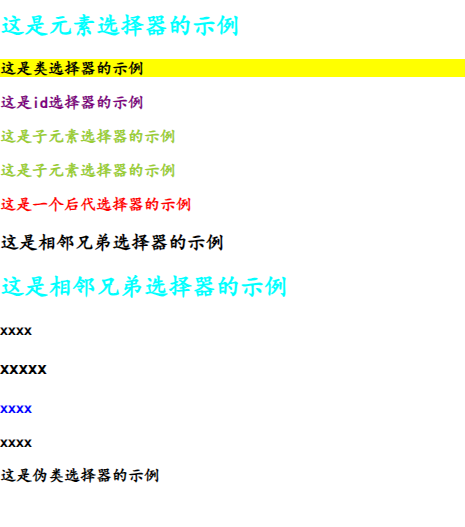
选择器
选择器就是用于选择要应用样式的HTML元素,他可以选择特定的元素,所有的元素,特定的类,特定的ID…..
| 元素选择器 |
类选择器 |
ID选择器 |
通用选择器 |
| 子元素选择器 |
后代选择器 |
并集选择器 |
伪类选择器 |
样例
建议根据下面的代码进行敲一遍,试一遍就都理解了的
1
2
3
4
5
6
7
8
9
10
11
12
13
14
15
16
17
18
19
20
21
22
23
24
25
26
27
28
29
30
31
32
33
34
35
36
37
38
39
40
41
42
43
44
45
46
47
48
49
50
51
52
53
54
55
56
57
58
59
60
61
62
63
64
65
66
67
68
69
70
71
72
73
74
75
76
77
78
79
80
81
82
83
84
85
86
87
88
89
90
91
92
93
94
95
96
97
| <!DOCTYPE html>
<html lang="en">
<head>
<meta charset="UTF-8">
<meta name="viewport" content="width=device-width, initial-scale=1.0">
<title>Document</title>
<style>
h2 {
color : aqua;
}
.highlight {
background-color: yellow;
}
#id{
color: purple;
}
*{
font-family: "KaiTi";
font-weight: bolder;
}
.father > .son {
color: yellowgreen;
}
.father .grandson {
color: red;
}
h3 + p {
color: blue;
}
#element:hover {
background-color: lightblue;
}
</style>
</head>
<body>
<h2>这是元素选择器的示例</h2>
<p class="highlight">这是类选择器的示例</p>
<p id="id">这是id选择器的示例</p>
<div class="father">
<p class="son">
这是子元素选择器的示例
</p>
</div>
<div class="father">
<p class="son">
这是子元素选择器的示例
</p>
<div>
<p class="grandson">
这是一个后代选择器的示例
</p>
</div>
</div>
<h3>这是相邻兄弟选择器的示例</h3>
<h2>这是相邻兄弟选择器的示例</h2>
<p>xxxx</p>
<h3>xxxxx</h3>
<p>xxxx</p>
<p>xxxx</p>
<p id="element">
这是伪类选择器的示例
</p>
</body>
</html>
|
CSS 常用属性
<display>``<width>``<height>``<font>
<background-color> <font-family>….
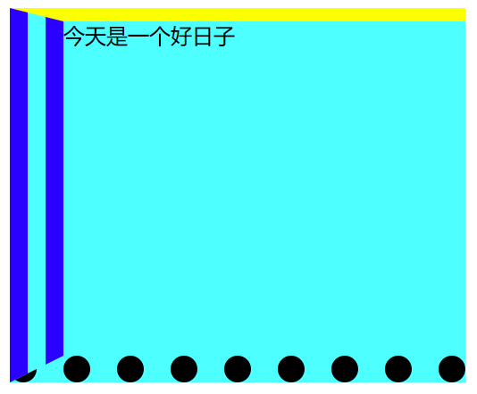
盒子模型
是CSS一种常用于布局的基本概念,将每个元素当作矩形的盒子
| 属性名 |
说明 |
| Content(内容) |
盒子包含的实际内容 |
| Padding(内边距) |
围绕在内容的内部,是内容与边框之间的空间 |
| Border(边框) |
围绕在内边距的外部,是盒子的边界 |
| Margin(外边框) |
围绕在边框的外部,是盒子与其他元素之间的空间 |
这些属性都是复合属性,可以设置多个样式
1
2
3
4
5
6
7
8
9
10
11
12
13
14
15
16
17
18
19
20
21
22
23
24
25
26
27
| <!DOCTYPE html>
<html lang="en">
<head>
<meta charset="UTF-8">
<meta name="viewport" content="width=device-width, initial-scale=1.0">
<title>Document</title>
<style>
.demo{
background-color: aqua;
display: inline-block;
border-style: solid dashed dotted double;
border-width: 10px 0 20px 40px;
border-color: yellow red black blue;
width: 300px;
height: 250px;
padding: 20px 40px 10px 30px;
margin: 40px;
}
</style>
</head>
<body>
<div class="demo">今天是一个好日子</div>
</body>
</html>
|
浮动
网页布局方式
- 标准流:网页按照元素的书写顺序依次排列
- 浮动
- 定位
- 自适应布局
浮动式相对于父元素浮动,只会在父元素的内部浮动
语法
1
2
3
| 选择器{
float: left/right/none;
}
|
浮动的特性:
- 脱标,脱离标准流
- 一行显示,顶部对齐
- 具备行内块元素的特性
1
2
3
4
5
6
7
8
9
10
11
12
13
14
15
16
17
18
19
20
21
22
23
24
25
26
27
28
29
30
31
32
33
34
35
36
| <!DOCTYPE html>
<html lang="en">
<head>
<meta charset="UTF-8">
<meta name="viewport" content="width=device-width, initial-scale=1.0">
<title>Document</title>
<style>
.father{
background-color: aqua;
height: 150px;
border: 3px solid red;
}
.left-son{
background-color: yellowgreen;
height: 100px;
width: 100px;
float:left;
}
.right-son{
background-color: yellow;
height: 100px;
width: 100px;
float: right;
}
</style>
</head>
<body>
<div class="father">
<div class="left-son">左浮动</div>
<div class="right-son">右浮动</div>
</div>
</body>
</html>
|

注意:如果father的height元素不写的话,就会出现子元素的大小超出了盒子的大小,因此就会出现坍塌的现象:
1
2
3
4
| .father{
background-color: aqua;
border: 3px solid red;
}
|

这个时候只需要写成即可:
1
2
3
4
5
6
| .father{
background-color: aqua;
/*height: 150px;*/
border: 3px solid red;
overflow:hidden
}
|
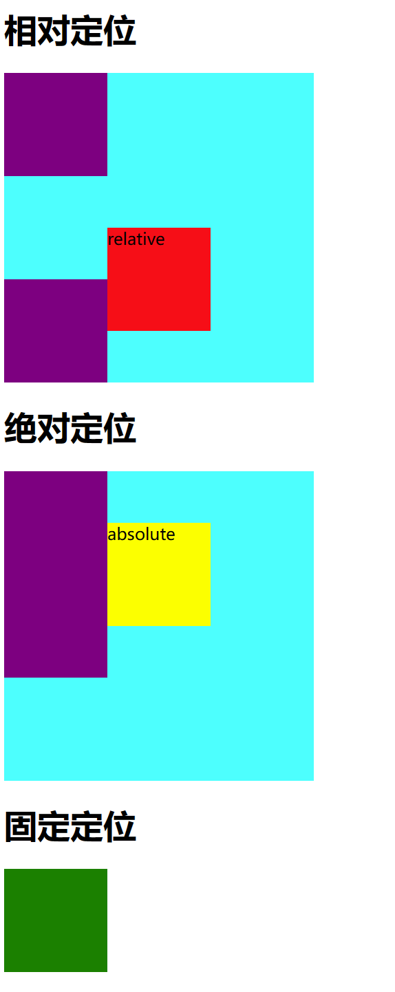
定位
相对定位
相对定位的元素相对于其正常位置进行定位。
- 元素仍然占据其在文档流中的位置,但可以使用
top, right, bottom, left 属性进行偏移。
- 偏移量是相对于元素在正常文档流中的位置。
- 其他元素的布局不会受此偏移影响。
绝对定位
绝对定位的元素相对于最近的已定位祖先元素进行定位。如果没有已定位的祖先元素,则相对于初始包含块(通常是<html>元素)进行定位。
- 元素从文档流中移除,不占据文档流空间。
- 使用
top, right, bottom, left 属性进行定位,偏移量是相对于最近的已定位祖先元素。
- 可以重叠在其他元素之上。
固定定位
固定定位的元素相对于浏览器窗口进行定位,即使页面滚动,元素也保持在相同位置。
- 元素从文档流中移除,不占据文档流空间。
- 使用
top, right, bottom, left 属性进行定位,偏移量是相对于浏览器窗口。
- 即使页面滚动,元素也不会移动。
案例:
1
2
3
4
5
6
7
8
9
10
11
12
13
14
15
16
17
18
19
20
21
22
23
24
25
26
27
28
29
30
31
32
33
34
35
36
37
38
39
40
41
42
43
44
45
46
47
48
49
50
51
52
53
54
55
56
57
58
59
60
61
62
63
64
65
66
67
68
69
70
71
72
73
74
75
76
77
78
79
80
81
82
83
| <!DOCTYPE html>
<html lang="en">
<head>
<meta charset="UTF-8">
<meta name="viewport" content="width=device-width, initial-scale=1.0">
<title>定位</title>
<style>
.box1{
width: 300px;
height: 300px;
background-color: aqua;
}
.box-normal{
width: 100px;
height: 100px;
background-color: purple;
}
.box-relative{
width: 100px;
height: 100px;
background-color: red;
position: relative;
top: 50px;
left: 100px;
right: 50px;
bottom: 100px;
}
.box-absolute{
width: 100px;
height: 100px;
background-color: yellow;
position: absolute;
top: 50px;
left: 100px;
right: 50px;
bottom: 100px;
}
.box2{
width: 300px;
height: 300px;
background-color: aqua;
position: relative;
}
.box-fixed{
width: 100px;
height: 100px;
background-color: green;
position: fixed;
}
</style>
</head>
<body>
<h1>相对定位</h1>
<div class="box1">
<div class="box-normal"></div>
<div class="box-relative">relative</div>
<div class="box-normal"></div>
</div>
<h1>绝对定位</h1>
<div class="box2">
<div class="box-normal"></div>
<div class="box-absolute">absolute</div>
<div class="box-normal"></div>
</div>
<h1>固定定位</h1>
<div class="box-fixed"></div>
</body>
</html>
|
总结
🆗🆗🆗🆗🆗🆗🆗🆗🆗🆗🆗🆗🆗🆗🆗🆗🆗🆗🆗🆗🆗🆗🆗🆗🆗🆗🆗🆗